Charts & Analytics
Visualize your wealth with interactive trend lines, allocation breakdowns, and monthly change analysis.
Insights at a Glance
Available Charts
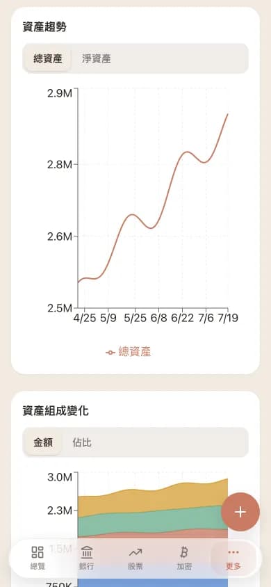
Asset trend line
A line chart showing your total assets, bank assets, stock assets, and crypto over your selected time period. Toggle individual asset types on or off.
Composition area chart
A stacked area chart showing how your mix across bank, stocks, and crypto changes over time. Switch between amount and percentage mode to read absolute values or allocation share.
Monthly change bars
Bar chart showing month-over-month changes in total assets. Quickly spot growth trends or periods of decline.
Period comparison cards
Summary cards showing start value, end value, and period change (both amount and percentage) for your selected timeframe.
How Snapshots Work
Charts are powered by daily asset snapshots generated automatically by a scheduled Celery task. Each snapshot records your total asset value and the breakdown by type at that point in time, using the exchange rates of that day. This means your historical charts are accurate reflections of your past portfolio value, not retroactive calculations. Snapshots begin accumulating from the day you start using WalletMap, and the system requires at least two data points to render trend charts.
Why we don't draw candlesticks (and what we draw instead)
WalletMap has four chart types and only four: net-worth trend line, asset composition stacked area, monthly change bar, and per-period performance comparison. We deliberately don't do per-stock candlesticks, technical indicators, or buy/sell markers. The reason is simple: that's what brokerages and trading software do, and we wouldn't out-execute them anyway. WalletMap's job is "overall financial health," not "next stock entry point."
Charts run on a snapshot system. Every day at midnight Taiwan time, a Celery task captures every position (converted to your reporting currency at that day's FX rate) into one snapshot record. So historical charts reflect what was actually true on that day — not estimates back-calculated from today. If a server hiccup means a snapshot didn't run that day, you'll see a gap; the chart line will skip to the next data point and we won't fabricate the missing day.
Our take: looking at a chart daily mostly just feeds emotional swings without meaningful insight. You should review monthly or quarterly, asking long-horizon questions like "is the accumulation rate on track? has my allocation drifted?" To support that habit, the trend chart's default ranges are 1M / 3M / 6M / 1Y / 3Y / All — there's no "intraday" option.
How do charts help you rebalance? The composition area chart, switched to percentage mode. If your target was 60% stocks / 30% bonds / 10% crypto and after six months it's drifted to 70% / 25% / 5% (stocks ran up), that's the rebalance signal. WalletMap won't proactively prompt you (that crosses into investment advice territory), but the chart makes the "need to act" signal visually obvious.
FAQ on charts
- Why does my history chart only show 30 days?
- Because snapshots only start accumulating from the day you started using WalletMap. 30 days means you've been here for about a month. The chart auto-extends as time passes — six months in, you have a six-month trend. We don't backfill history with "assume this is your past allocation" — that looks pretty but lies.
- Can I export charts as PNG?
- Charts themselves don't export today, but the underlying snapshot data ships with the Excel export (one row per snapshot: date, total assets, per-category amounts), so you can render whatever charts you want in Excel or Numbers. Export is designed to give you data; how you visualize is your call.
- Can I get "alert me if it drops X%" notifications?
- Not supported, and not on the roadmap. The honest reason is that those alerts encourage emotional trading, while WalletMap is built to keep you on a long time horizon, not nudge you into short-term moves. If you want alerts, your brokerage app probably has them.
- Do charts auto-update, or do I need to refresh?
- When you open the dashboard, the latest positions and quotes are pulled live to compute current total assets — that's the rightmost point on the trend line. The historical portion is fixed snapshots and won't change. So adding a transaction today and refreshing will move the rightmost point, but yesterday and earlier are frozen and won't be back-calculated.
Explore Other Features
Ready to Take Control of Your Assets?
Start tracking your assets with complete privacy. Your data never leaves your Google Drive.
Get Started Free